
New Cube Viewer & Set Editor in Planning Analytics (2022)
What’s New In Planning Analytics?
IBM’s latest releases include a “new experience” cube viewer (or exploration) and a newly configured Set editor. There are several improvements and enhancements to the new viewer and set editor that represents IBM’s direction in making features easier to access.
This article covers the updates to the cube viewer and set editor from the 2.0.71, 2.0.73, and 2.0.74 releases. IBM is focused on improvements to the “new experience” within Workspace as it plans to deprecate the “classic experience”. You and your team should plan on upgrading your Planning Analytics environment soon to take advantage of these new features.
This article also serves as a “how to guide” for navigating to and using the new features and tools.
New Experience Cube Viewer
Enable the New Features
By default, the new capabilities are turned off. To use the new view and set editor, you need to enable the new feature in Features within Administration.
Click on the Home icon and select Administration from the drop-down.
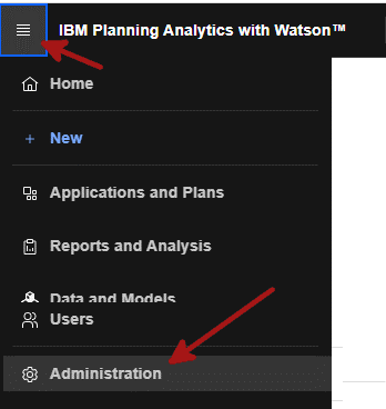
Navigate to the Features tab and hit the enable button.
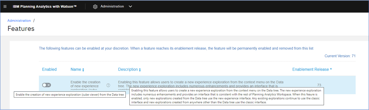
The name of the feature and the description are not entirely visible, but you can hover your cursor over each to see the full text.
Here is the full text:
Name – Enable the creation of new experience exploration (cube viewer) from the Data Tree.
Description – enabling this feature allows users to create a new experience exploration from the Context menu on the Data Tree. The new experience exploration includes numerous enhancements and provides an interface that is consistent with the rest of Planning Analytics Workspace. When this feature is enabled, only new explorations created from the Data Tree use the new experience interface. Any existing explorations continue to use the classic interface and new explorations created from anywhere other than the Data Tree use the classic interface.
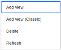
You can access the new exploration and set editor only through the Data Tree by right-clicking on a cube and selecting Add new view or right-clicking on existing view and selecting Add View.
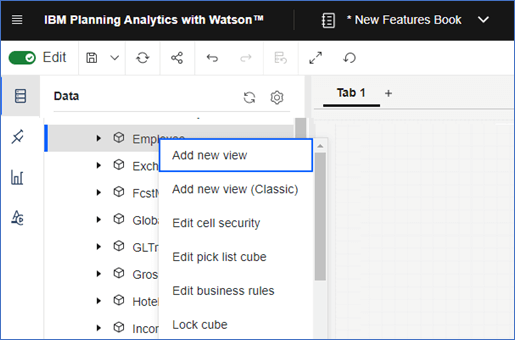
You can also add a new view using the “Classic” interface which will open the previous style cube viewer, but you won’t see the new features.
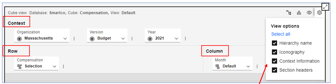
The new cube viewer has a different style in the overview area which contains the dimensions/hierarchies and four new buttons in the top right-hand corner.
Overview area
The new buttons in the upper-right portion of the Overview area give you quick access to new and old features.

Show cube/view in Data Tree – This icon expands the Data tree and highlights the view you are using in the exploration. This will only work in Edit mode and if the Data tree is displayed.

Collapse Overview – click on this icon to hide the overview, but keep the four buttons visible. This is similar to the function that we have in the toolbar with the Edit button enabled except, when using it in the toolbar, everything in the overview area is hidden, including the four buttons.
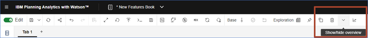

view the Bench – click here to view dimensions on the Bench. Dimensions on the Bench are hidden and don’t appear in the Context, Rows or Columns. More details on this later.

Settings – click here to get a drop-down of view options for the exploration. Select or de-select the following items;
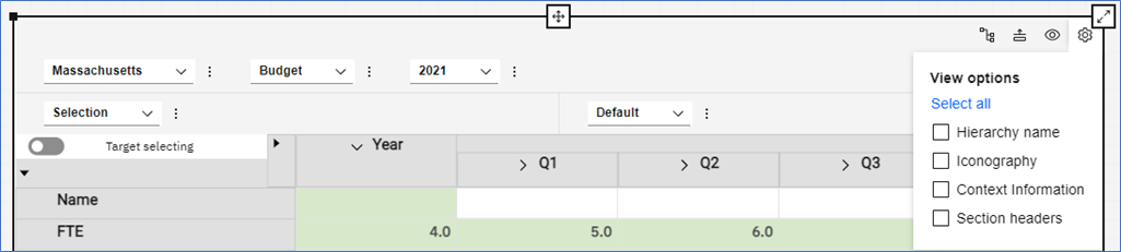
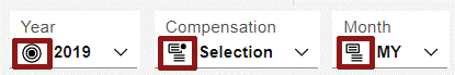
Hierarchy Name – show or hide the dimension/hierarchy names, Year in this example.:

Iconography (enabled by default) – show or hide the icons that appear with each dimension. Below each icon is represented from left to right: Context, Rows, Columns.
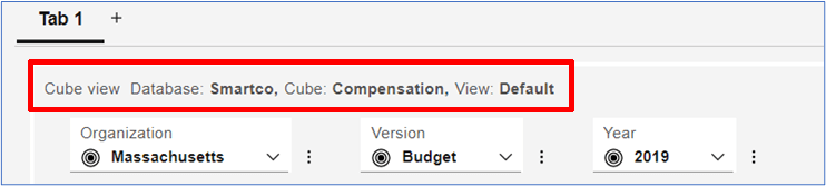
Context Information – shows the database, cube, and view that support your exploration.
Section Headers – show or hide the headers for each part of the overview area.
Visualization Properties
The Properties is another area that has been enhanced. The Custom section is the only part that has changed. The Visualization, General, and Synchronize sections are the same.
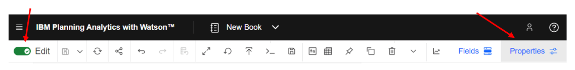
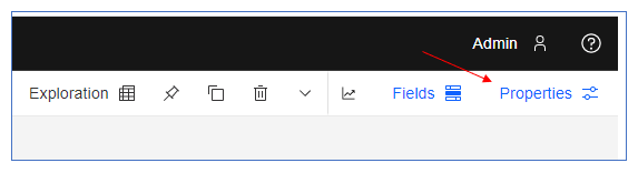
In Edit mode, with the exploration highlighted, click on Properties.
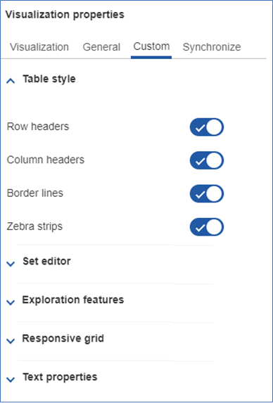
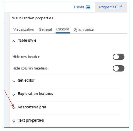
Within the Custom section, note that the pre-configured themes are no longer available. The features contained in those themes will be broken down into individual features in a future release.
Table Style now contains the buttons to hide row and column headers plus Border lines and Zebra strips.
The Set editor button retains its ability to allow or deny access to the set editor.
The Exploration features are the same as the Classic viewer if you have been keeping up with the latest releases. Expect to see more features here in upcoming releases.
The Responsive grid is brand new and we will cover that below.
Text properties has also not been updated yet. However, you can update text styles in visualizations. See below.
Text style for Axis Values in Visualizations
Within visualizations, you can apply text styles to the value axis labels and value labels. Previously, you could apply styling to only item axis labels.
Right-click any axis label or value label and click Style text to select and apply text styles.
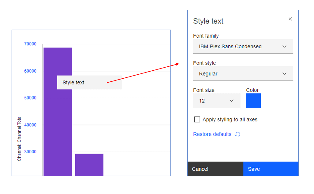
Choose your preferred Font, Font Style, Font Size, and Color.
You can apply these changes to all axes.
For value labels, the Style text menu is slightly different and includes Contrast color and Label shadow options for accessibility.
Right-click on a value label and choose Style text.
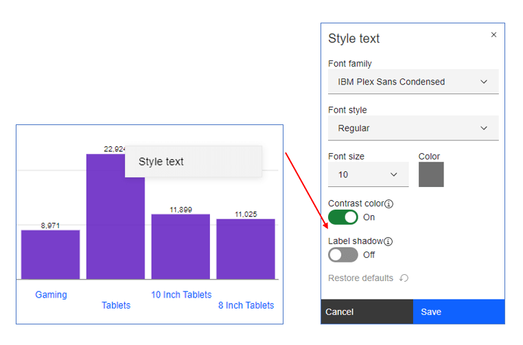
When Contrast color is on, it auto-adjusts the font color and overrides the selected color.
Turning on Label shadow adds a shadow to value labels. Note that the change here is subtle and may not be noticeable when a small font is used.
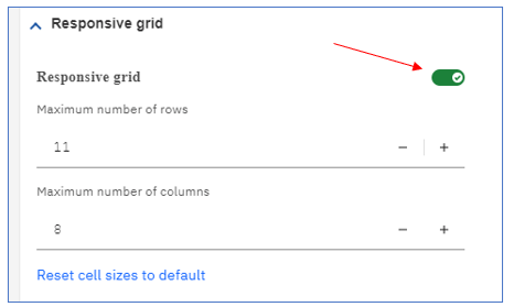
The Responsive grid property
A new Responsive grid property makes the view respond to size changes by preserving the number of columns and rows you set no matter the size of the grid. Set a fixed number of columns and rows and the view displays the fixed number of columns and rows when you resize the grid. The contents of the exploration will respond to size changes including font sizes for the headers and the data.
To explore this new property, add a new view and enable the Responsive grid for your view. The Responsive grid is disabled by default for new views.
We are using the Smartco instance in this example.
-
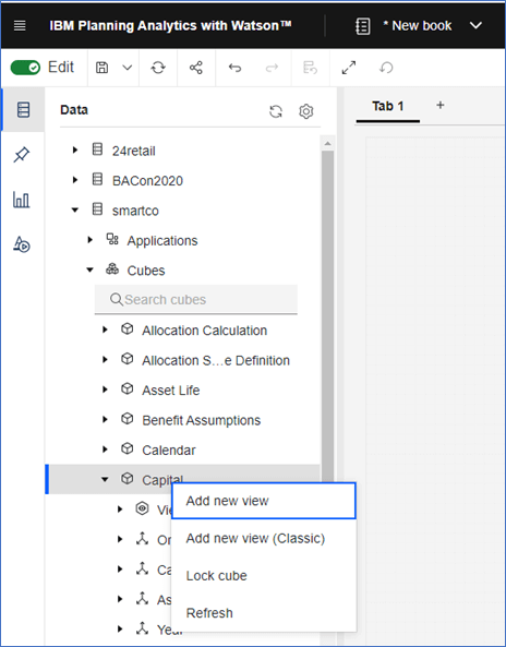
Right-click on the cube and select “Add new view”. The view will be placed on the canvas.
-
You can also right-click on an existing view and select “Add view” to get the new experience view.
-
Note that with each method of adding a view to the canvas, you can choose the “Classic” view.
The view will appear on the screen with conventional functionality, meaning that you can resize the view and the number of rows and columns showing, may change if the window becomes too small. You might also see a partial column or row as shown below.
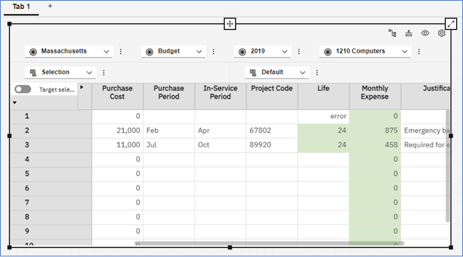
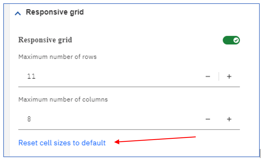
Pro Tip – Before you enable the Responsive Grid for your specific view, you should resize the columns as you normally would using the column resizing handle <-||->, paying particular attention to the far-right column (the Justification column in our example) You should expand the far-right column before enabling the Responsive Grid. You won’t be able to resize the far-right column once the Responsive Grid is turned on for the view. (If you discover the need to resize your columns, you can always turn off the Responsive Grid, resize any of your columns, then turn it back on.)
Below we have set our column widths.
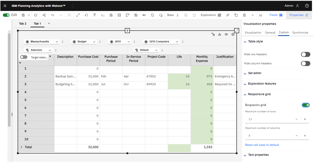
To turn on the Responsive Grid for your new view, with the view highlighted, click on Properties.
The Properties panel will appear.
Go to the Custom tab and open the Responsive Grid.
Once enabled, the Responsive Grid operations come into focus;
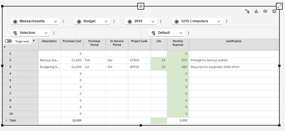
The Responsive Grid is now turned on for this view. The initial number of rows and columns shown here may be determined by your view, however this is not always the case.
If the number of rows and columns in the Responsive Grid match those of the Default view or your chosen existing view, the row and column sliders will not appear regardless of the size of the view.
Below is the same view set to a smaller size.
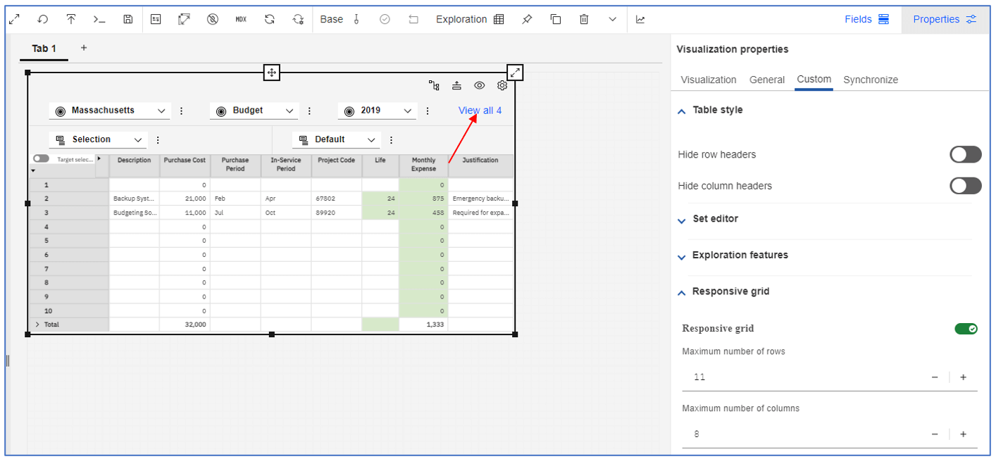
Note: In the view above, in the upper-right you see View all 4, click on this to compress the context area and show all four dimensions in the Context. You can also expand the view horizontally to see all the dimensions in the Context.
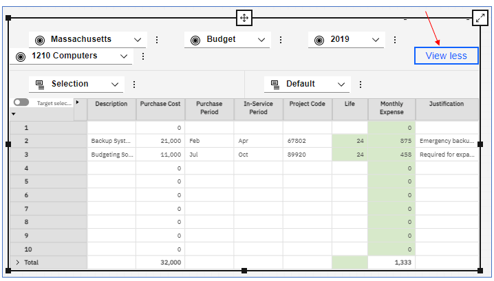
With View all 4 clicked, the 4th dimension appears in the context and the View less button appears which will revert the context back to the original setting.
To reset the cell sizes, including any column width changes, click on the Reset cell sizes to default button. If the column or row sizes have not been manually adjusted, then nothing will change.
New Behavior for Dragging and Dropping a View
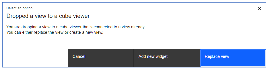
You can drag a view from the Data Tree and drop it onto the cube viewer. You will get the classic view when you do this. If you drag the new view on top of an existing view, you will now be prompted to either replace the existing view or create a new widget. If you choose Add new widget, the new view will appear with the existing view. If you choose Replace view, the existing view is completely removed and the new view inherits the existing view’s properties.
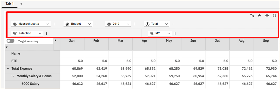
Target Selecting Toggle for Asymmetric Calculation
The new Target selecting toggle is used to create an asymmetric calculation. Previously, you could click the Selector on the row or column headers to create an asymmetric calculation
Now, you can enable Target selecting and select the members that you want to use in the asymmetric calculation. Target selecting initiates an asymmetric calculation for row or columns.
Enable Target selecting, then select members to be included in the calculation. Right-click on any of the selected members and click Create calculation.
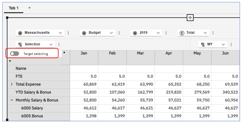
With Target selecting enabled, select row or column members to include in the calculation – click on the first member then control-click on subsequent members. Each selected member will be surrounded with a blue line.
Right-click on any selected member and click on Create calculation.
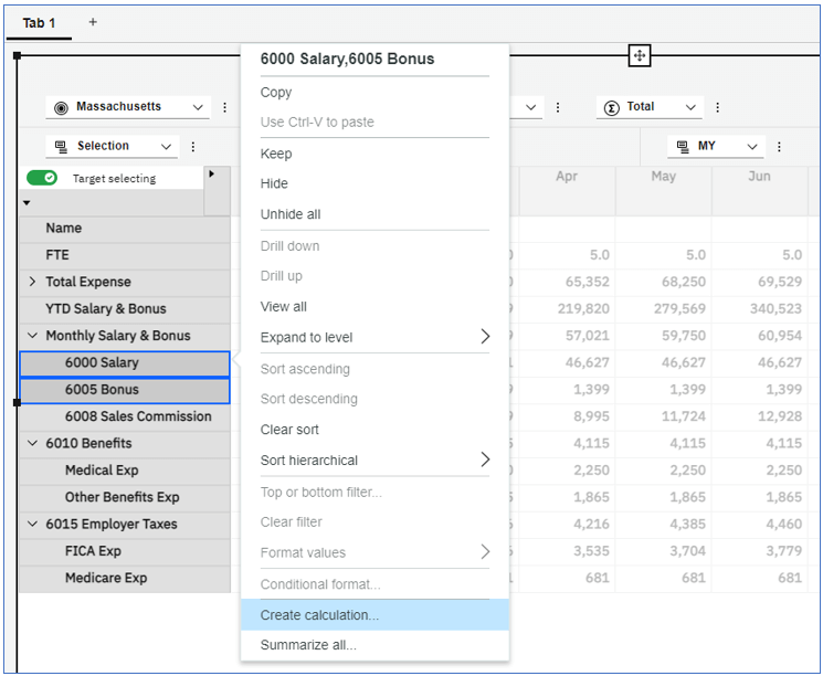
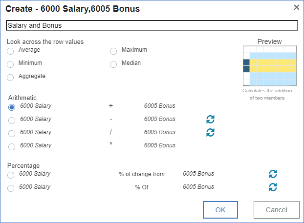
Enter a name for the calculation and set the type of calculation (Average, Minimum, Aggregate, Arithmetic or Percentage).
In the example below we chose to add accounts 6000 and 6005.
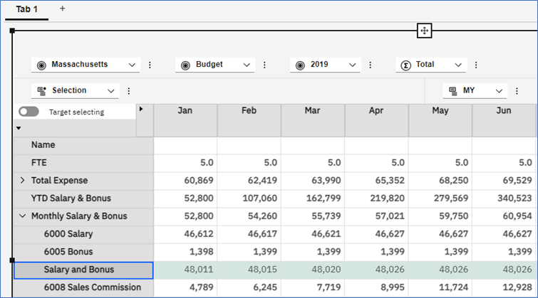
Target selecting is automatically disabled after the calculation is completed.
Updates to the Process Editor
IBM has updated the Process Editor to further standardize the Planning Analytics Workspace user experience. Note that any existing process editors that were previously saved in a modeling book or workbench remain available using the previous interface in the modeling book or workbench.
The style of the process editor has been changed to mirror the look and functionality of other objects within Workspace.
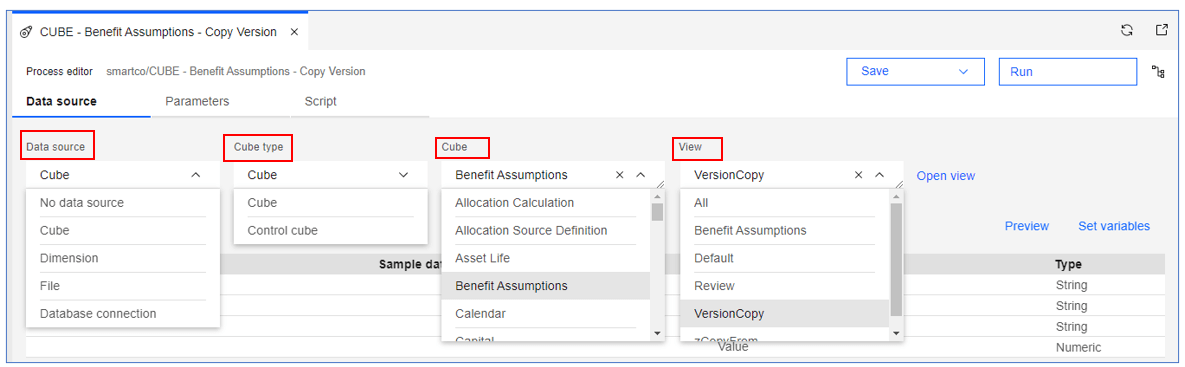
The Data source tab has been updated to include all aspects of the source data.
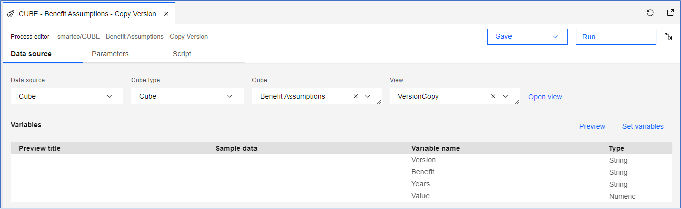
Now there is a drop-down menu for each data source property, which minimizes having to navigate to different areas to establish the data source. Below, a cube is chosen for the data source which genertates other prompts to define the type of cube, the cube name and the view used in the process. Click Open view to open the view in an Exploration.
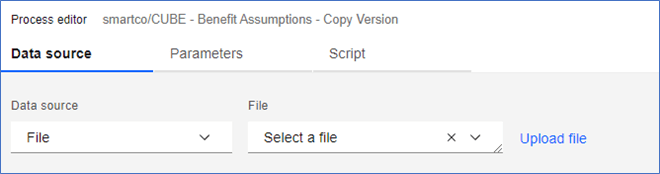
When File is chosen for the data source, a prompt appears for the file to use.
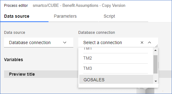
When Database connection is chosen, you can use SQL and TM1 database sources.
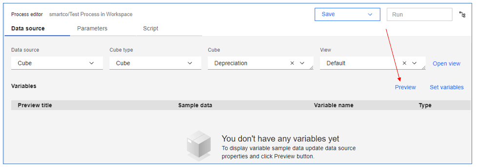
In a new process where you have chosen a cube as your data source and you have made your view selection, click Preview first then Set variables to apply changes to your variable names and variable types.
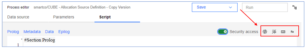
On the Script tab, you can enable or disable the permission for a process to modify security data with the Security access switch.
Also on the Script tab are new icons to:

Insert a process function

Enable line wrapping

List the Shortcut keys

Change the script’s font
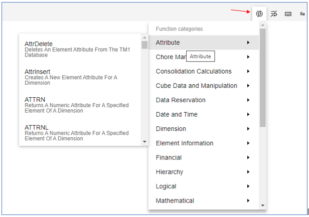
Insert a Process Function
Place your cursor within the script where you want the function to appear, click the Insert function icon, navigate to the function, and select.
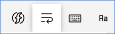
Enable Line Wrapping
Click the enable/disable line wrapping icon and it will appear without the slash when enabled.
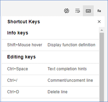
Shortcut Keys
Click the shortcut keys icon to see all the available shortcuts within the Script tab. The keys are categorized as Editing keys, Search and Replace keys, Navigation keys, Selection keys, and Process Editor keys.
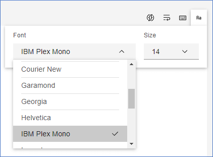
Change the Font
To change the font within the script, click on Font icon and select the font and size you want from the drop-downs.
Copy and paste images, pictures, web pages, and text
You can now copy an image, media, web page, or text and paste it directly into an IBM Planning Analytics Workspace book. The software automatically identifies the type of content you pasted and converts it to the appropriate widget, simplifying the process to add content.
Note that an image file size must be less than 200 KB.
Open a book in Edit mode, copy and paste content directly into a book. Click anywhere in the book and use CTRL+V (Windows) or CMD+V (Apple Mac) to paste the copied content.
You can copy paste:
-
Images from your computer, online images from your browser, or links to image files
-
URLs to media format (such as online videos)
-
URLs to web pages
-
Text
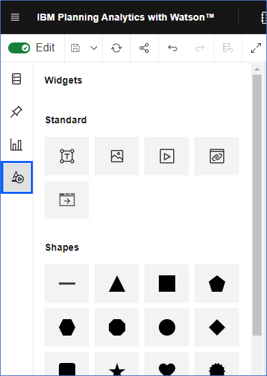
You can also continue to add content to your book by using the Widgets icon in the side bar. If you are using a Widget, you can right-click or CTRL+V to paste into the Widget.
Updates to the Set Editor
Access to the Set editor and Set editor itself has been updated.
You can access the Set editor in two new ways;
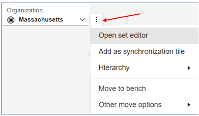
Click the drop-down on the dimension tile or click the overflow menu beside the tile.
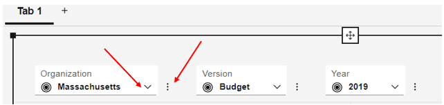
Click on the drop-down and select Set Editor at the bottom of the drop-down window.
If using the overflow menu, click on the three-dot button and click on Open set editor.
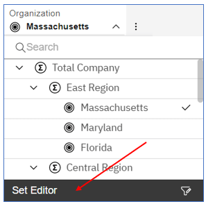
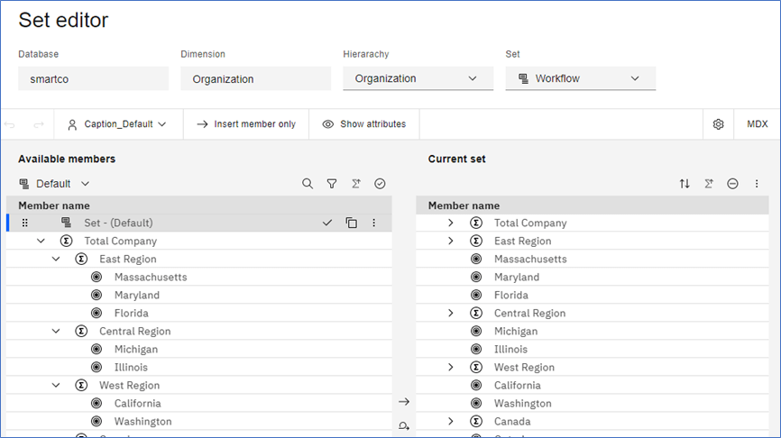
Regardless of the method you use*, the Set Editor opens to fill the screen;
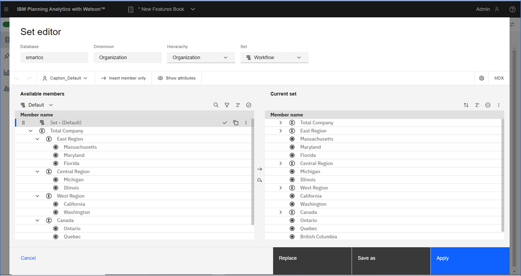
You can see some similarities to the old version; on the left we have Available members and on the right, we have the members of the Current set.
At the bottom of the Set editor are the same options as before. We can Cancel, Replace the Current set, save as a new subset, or simply Apply the changes to the Current set to the Exploration.
*The new set editor is not a widget that you can drag onto the canvas from the Data tree. If you choose to drag the set editor from the Data tree, you will work with the old set editor.
The top of the Set editor displays four facts about the set; the Database, the Dimension, the Hierarchy of that dimension and the current subset or Set we are working with.
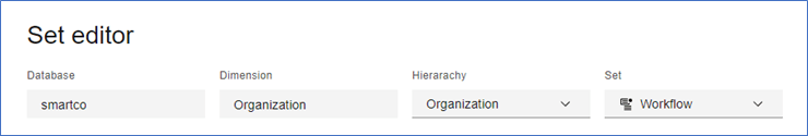
The Database and Dimension are fixed, but you can select another Hierarchy and Set if necessary. Click on the drop-down chevron to select another hierarchy or set, if they are available.
Updating How Members are Displayed in the Set Editor
Also in the top part of the Set Editor are the buttons for changing the Alias, Insert Member behavior and displaying attributes/properties.
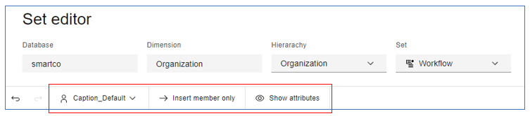
The names of the first two highlighted buttons (from left to right) are showing the selection made for each. For example, the first button indicates the Caption_Default is currently displayed as the Alias. The second button describes the insertion behavior (Insert member only) for the current set (described below).
To change the Alias or revert to the Member ID, click the drop-down
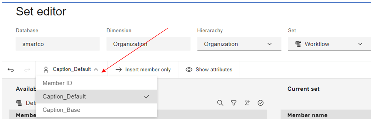
This changes the Alias for both the Available members and the Current set.
Working with Available Members in the Set Editor
The way you work with the Available members has changed, but most of the operations are the same. We will outline the differences here.
Inserting Members into the Current Set
The Insert member only button which controls insertion behavior, works in conjunction with the insertion icons in the middle of the Set editor. The insertion button controls what is to be inserted into the Current Set.
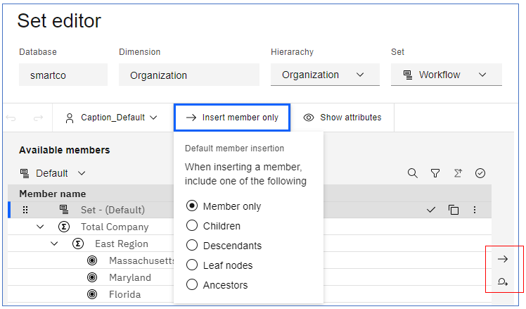
The insertion options here determine how the new members are to be inserted. There are two options; Insert and Replace Set.

Insert adds the new member or members to the Current Set.

Replace Set removes all members in the Current Set.
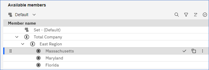
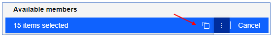
If you select a single member to insert into the Current set as shown below, the member is highlighted and one icon appears on the left of the member name and a set of icons appear to the right of the member name.

From here you can move the member by dragging and dropping it to a new location using the grab handle

or you can keep this member,

copy,

or access the overflow menu.
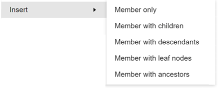
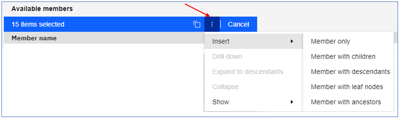
To control what is inserted into the Current Set we have five choices;
Member only – this can be one or more selected members
Children – these are the immediate children of a selected consolidation
Descendants – all descendants of a consolidated member
Leaf nodes – all leaf nodes in the dimension
Ancestors – all ancestors of a leaf or consolidated member
If you select two or more members, the toolbar, above the member names turns blue and includes the same functions as selecting a single member. Note that the grab handles remain with each member, however if you click on one, you will be moving all the members selected.
The overflow menu also gives you the same options as it would a single member. See the overflow menu options below.
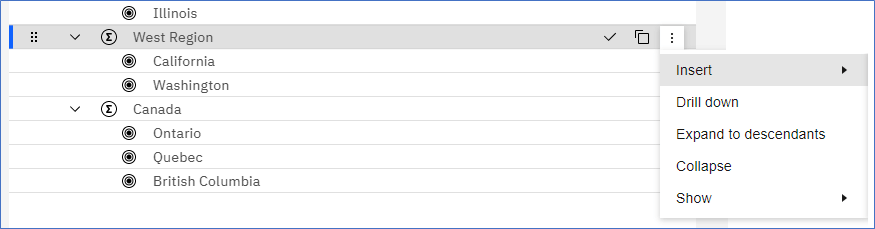
Insert Options from the overflow menu
When inserting consolidated members, there are five choices;
When inserting a leaf-level member, all the options will insert only the chosen member except Member with ancestors.
If the top-level consolidated member is chosen, Member with ancestors will not be available.
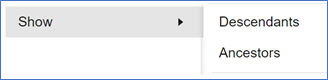
Show Option
The Show option will filter the Available members to show only the member chosen plus the descendants or ancestors. If a consolidated member is chosen, Descendants and Ancestors can be shown. If the top-level consolidated member is chosen, only Descendants can be shown. If a leaf-level member is chosen, only Ancestors are shown.
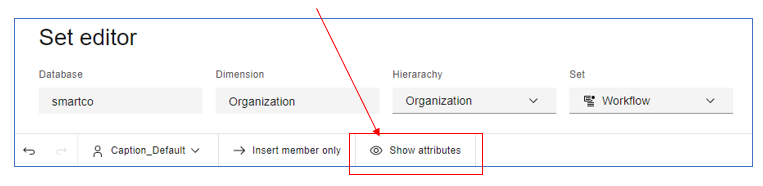
Displaying Dimension Attributes in the Set Editor
To view the attributes, click on the Show attributes.
The Show attributes screen opens occupying the full screen. In
On the left are available attributes and properties. Use the check boxes to select the attributes and properties you want to see in the Set editor. Choose Select all to view all attributes and properties. Your selections will immediately appear in the right panel. Also in the right panel, you can remove a selected item individually or you can click on Remove all to clear the Selected panel.
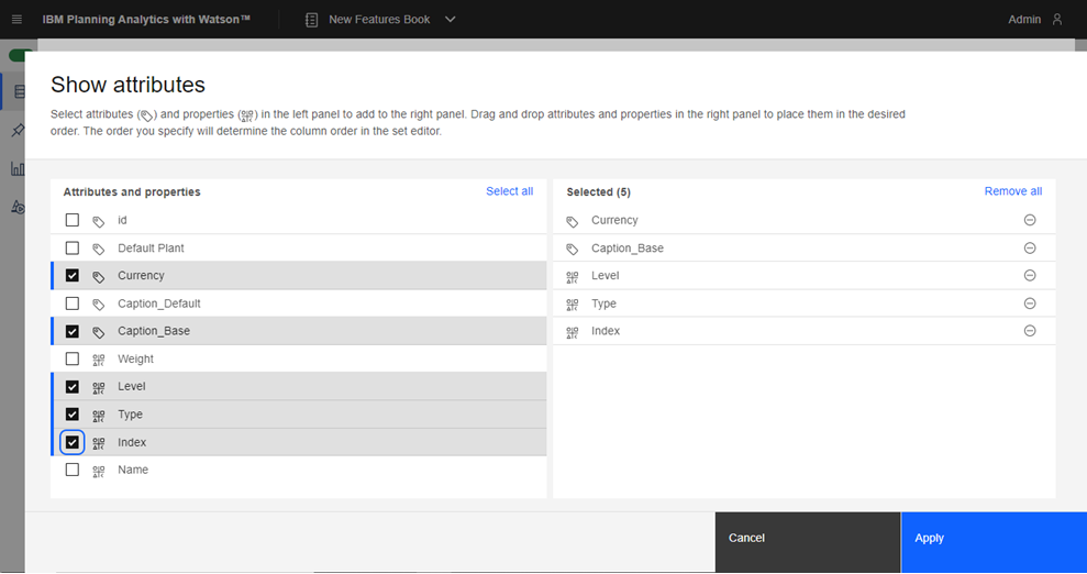
Click Apply to display the attributes and/or properties. The attributes will show in Available members and in the Current set. In the previous version, the attributes appeared only within Available members.
Note the icons associated with attributes and properties. The association is displayed in the text just below the Show attributes label in the picture above.

Attribute – your administration defines these values.
Show or Hide the Available Members Panel
In the previous Set Editor, you could work with a single panel of either the Available Members or the Current Set. In the new Set Editor, you can only remove the Available Members panel.
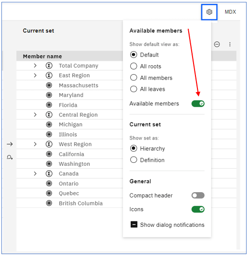
Click on the gear icon and disable Available members to see only the Current set in the editor.
The Set Editor showing only the Current set. This gives the user a lot more space to work with.
Other options in the Set Editor Settings
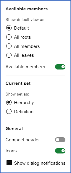
Important: the changes you make to Settings are persistent. After making changes to Settings, they will remain the same when you close and re-open the Set Editor.
Note there is a section for Available members and Current set.
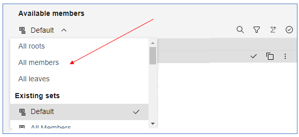
For Available members you can choose to have the Set Editor open to the Default subset if you have one, or to the All roots, All members or All leaves subset.
For the Current set, you can show the set as a Hierarchy or Definition. (These are the same features within the Classic set editor.)
General
You can compress the Set editor header by enabling Compact header. This will give you more space to work with.
You can disable the icons that show to the left of member names in both the Available members and Current set.
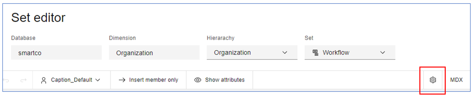
MDX in the Set Editor
Another important change to the Set Editor is how the MDX is displayed. Click on the MDX button and another panel will open showing the MDX generated for the Current set.
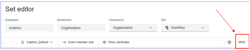
Changes made in the Current Set panel will be immediately reflected in the MDX panel. Also, changes to the MDX will immediately change what you see in the Current Set panel when you click the Commit button.
Set Editor Controls for Available Members and Current Set
Also within the set editor are separate controls for Available members and Current set;
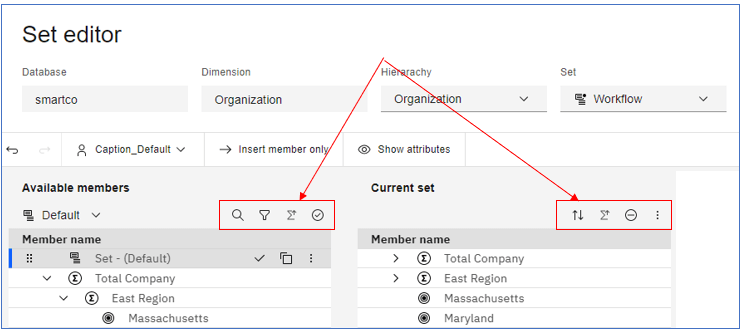
For Available members there are five ways to control the contents of the Available members panel.
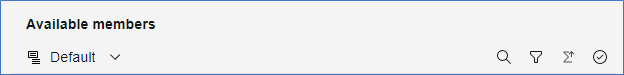
Choose the subset to display which includes system subsets (All roots, All members and All leaves).
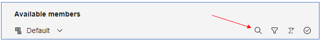
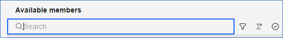
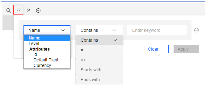
To search for a member, click on the magnifying glass icon.
A blue search box will appear. Enter your search terms and the results will appear automatically.
Click on the filter icon to filter on the Name, Level or attributes. Click on the Contains drop-down to refine your filter, then enter the keyword to filter on. Click Apply when complete. The filter will apply immediately. Click the filter icon again and click Clear to remove the filter.
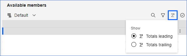
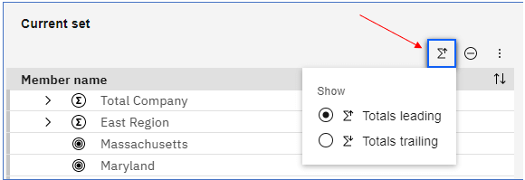
Click the Sum icon to change where the totals are displayed.

Click the Select all icon and all members will be highlighted and the number of items selected will appear at the top.
Click the More icon to move selected members to the Current set.
You can copy the selected members and paste them to the Current set.
Using the Current Set
For the Current set panel there are four ways to control how the members are displayed.

Set the totals location

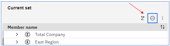
Remove all members

Convert to static

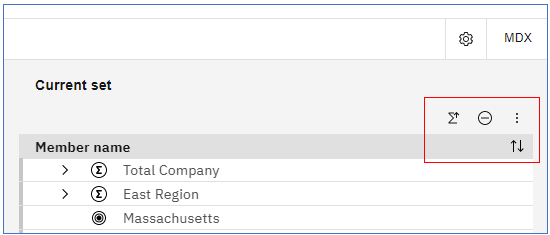
Sort
Use the Sort button to sort by member name – Ascending, Descending, Hierarchize, Hierarchically Ascending and Hierarchically Descending.
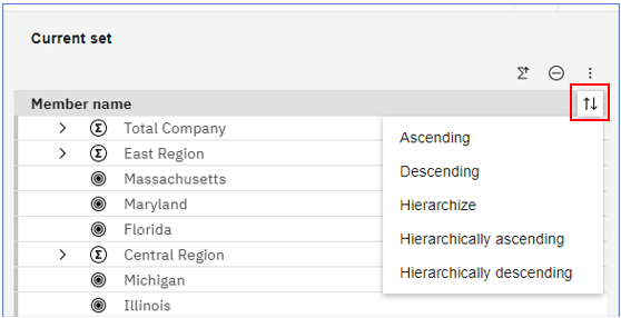
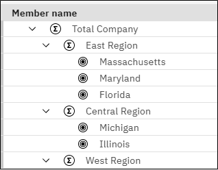
Hierarchize sets the order of the hierarchy showing parent/child relationships.
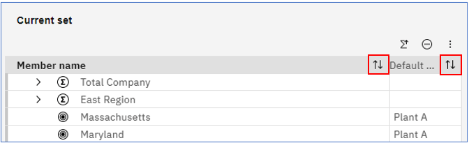
Also within the Current set, you can sort by attributes. When attributes are shown, a Sort icon will appear beside each attribute name. This feature was made available in release 2.0.73.
In the example below, you can sort by the Member name or the Default Plant attribute. If you sort by Member name, you have the same sort options as above. If you sort by an attribute, you have all options except Hierarchize.
Click the Sum icon to change where the totals are displayed.
Remove all the members in the Current set.
Click the More options button to convert the subset to static*.
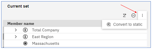
*Static subsets do not change when new members are added to the dimension. Static subsets have to be manually changed.
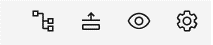
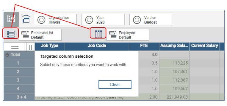
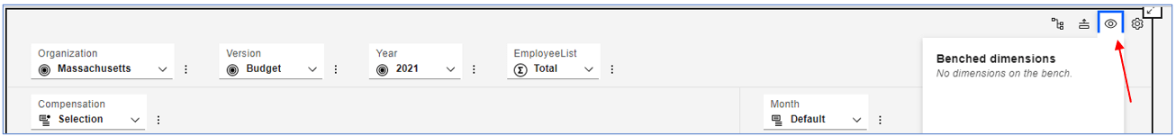
The Bench
The Bench is a new name for an old feature that is used to remove or hide a dimension within a grid. To access the Bench, click on the eye icon in the upper-right corner of the grid. In this example, no dimensions are benched.
To place a dimension on the bench, click the overflow menu next to the dimension you want to move and select Move to bench.
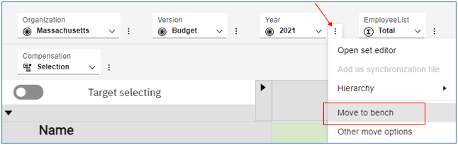
You can also select Hierarchy and Remove to put the dimension on the Bench.
A dimension on the bench does not appear on the grid, but will affect the grid as if in the Context area. It doesn’t matter if the dimension came from the rows, columns or context, if it is on the Bench, it affects the Context.
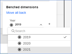
Since the benched dimension still affects the context, you can select individual members of the dimension to make changes to the data.
Click on the drop-down arrow and select a different year. The data shown in the grid will change from 2019 data to 2021.
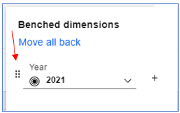
To move the benched dimension back to the Context, click on the plus sign to the right of the dimension or you can select Move all back to move all the dimensions on the bench back to the Context area. If you hover your cursor over the dimension, you can drag and drop the dimension onto the rows, columns or context area. Note that grab handles appear to the left of the dimension.
Other Dimension/Hierarchy Updates
There are now more ways to re-arrange dimensions and hierarchies within your exploration.
Click on the overflow menu and select Other Move Options. Depending on where the hierarchy is (Context, Row or Column), the options available will change.
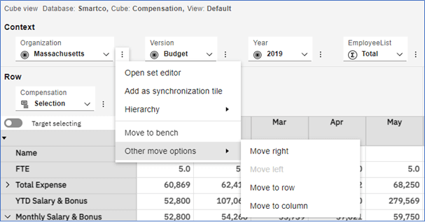
If your dimension is in the Context, then all options are available unless the dimension is at the extreme right or left of the Context. In this example, Organization is already at the far left, so Move left is grayed out.
Depending on where the dimension is in the Context, if you choose Move right or Move left, the Organization will move one place to the right or left.
If the dimension is in the Rows or Columns, your options will vary.
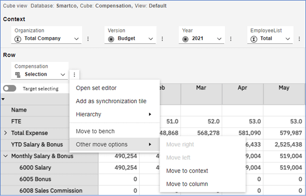
From the Row, your Other Move Options are Move to Context or Move to Column. If you are moving from a Column, your move options will be Move to Context or Move to Row.
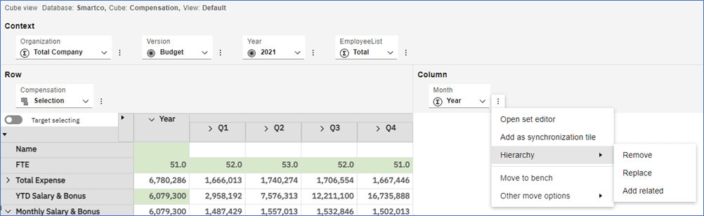
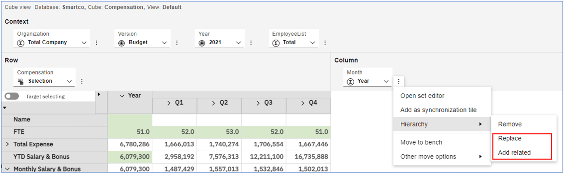
There are two other options when selecting Hierarchy within the overflow menu; Replace and Add Related. These two options are available only if there are more than one hierarchy available within the Dimension. Replace replaces one hierarchy for another from the same dimension. Add Related adds another hierarchy to the Context, Column or Row where the dimension appears. At this time, we do not have a use case for the Add Related feature.
Summary
As mentioned at the beginning of this article, IBM will be releasing new features within the new cube viewer and set editor in an effort to modernize and improve the user experience within Planning Analytics Workspace. If you haven’t already, we encourage you to upgrade soon to take advantage of these new features. If you have any questions or would like Budgeting Solutions to provide guidance and support for your analytics solution, contact us today.
Share this Article: [DISPLAY_ULTIMATE_SOCIAL_ICONS]